Shoot Shoot Penguin
Design System

Shoot Shoot Penguin의 초기 화면을 검토하며, 반복 요소의 스타일과
색의 의미가 화면마다 달라지는 문제를 발견했습니다.
조작 요소와 경기 상태의 표현을 분리하고, 토큰과 컴포넌트를 정리해
두 사용자 화면에 적용할 공통 기준을 만들었습니다.

Reviewing the first screens of Shoot Shoot Penguin, I found that repeated elements were styled differently from screen to screen, and that colour meant something different in each one.
Separating how controls and game state were expressed, then settling the tokens and components, gave one standard both sides of the app could be built on.

TWO-SIDED PLATFORM PREDICTION UX MOBILE APP IN DEVELOPMENT
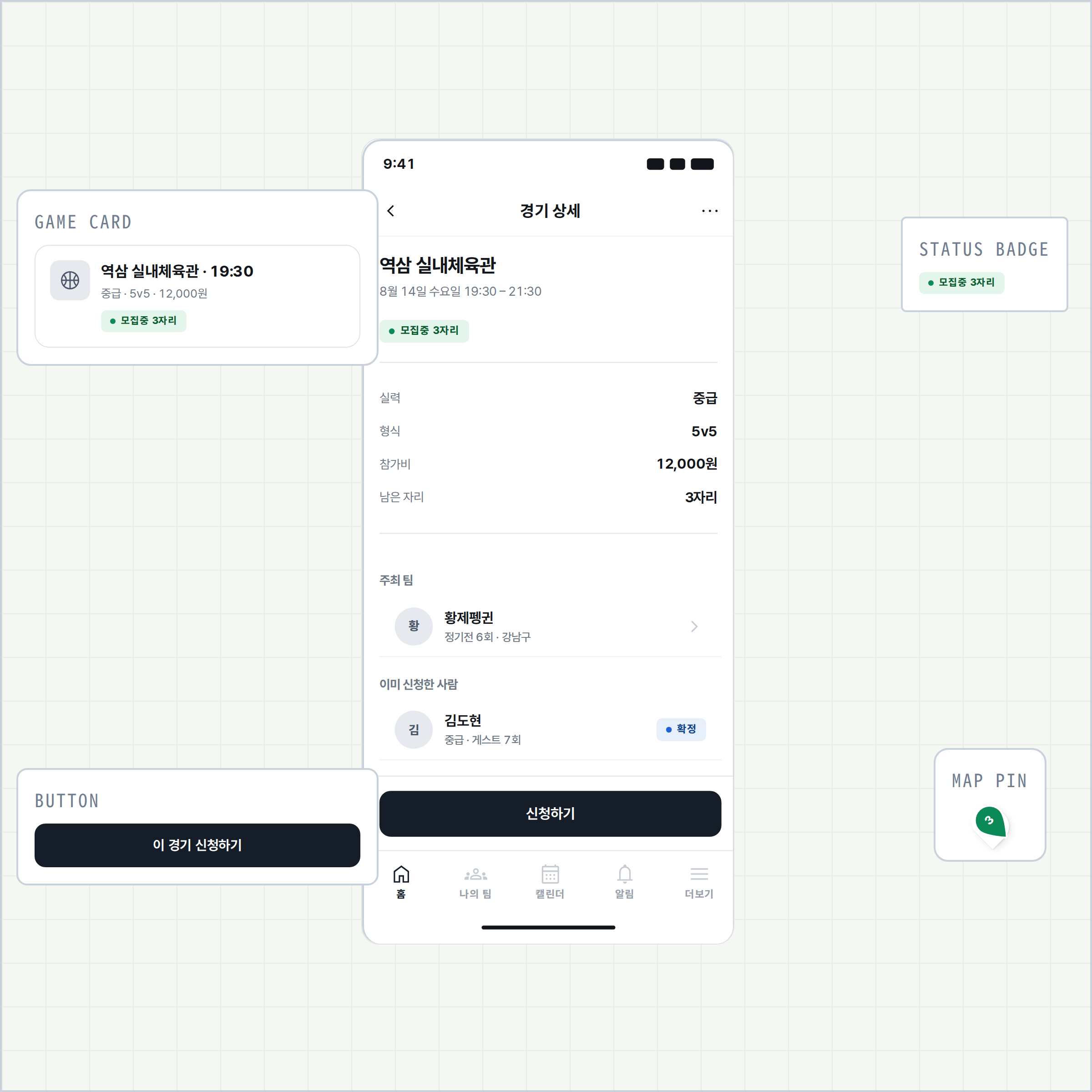
The Shoot Shoot Penguin game detail screen with four of its components called out around it — game card, status badge, button and map pin
역할ROLE
Product Designer
범위SCOPE
프로덕트 기획 · 정보 구조(IA) · UX/UI · 디자인 시스템 · 개발 핸드오프
Product planning · IA · UX/UI · Design system · Developer handoff
상태STATUS
디자인 시스템 v1.5.0 · 화면 개편 진행 중
Design system v1.5.0 · screen redesign in progress
TEAM
1 Designer · 1 Developer
01 / Summary
문제Problem

화면별로 제작한 초기 UI에는 반복 요소의 스타일 차이가 있었고, 같은 색이 버튼과 경기 상태를 함께 나타내고 있었습니다.

The first UI was built screen by screen, so repeated elements were styled differently, and one colour stood for a button and a game state at the same time.

접근Approach

색의 역할을 분리하고, 타이포그래피 · 간격 · 컴포넌트를 공통 규칙으로 정리했습니다. 예측 정보는 확정 정보와 구별되도록 표현했습니다.

Colour’s roles were separated, and typography, spacing and components were settled into shared rules. Predicted information was expressed so that it reads as distinct from confirmed information.

산출물Deliverables

디자인 토큰, 컴포넌트 26그룹, 브랜드 자산과 화면 적용 시안을 제작했습니다. HTML/CSS에서 규칙 위반을 확인하는 검사 프로그램도 구성했습니다.

Design tokens, 26 component groups, brand assets and applied screen mockups. Plus a checker that finds rule violations in the HTML and CSS.

02 / Context

두 사용자의 다른 작업을
하나의 UI 기준으로 연결했습니다

Two users, two different jobs,
joined by one UI standard

Shoot Shoot Penguin은 팀 리드의 게스트 모집과 플레이어의 경기 탐색을 연결하는 농구 앱입니다.
팀 리드는 출석과 모집 인원을 관리하고, 플레이어는 지도에서 참여할 경기를 찾습니다.

Shoot Shoot Penguin is a basketball app that joins a team lead’s guest recruiting to a player’s search for a game. Team leads manage attendance and how many guests they need; players find a game to join on a map.

같은 경기 정보도 관리하는 화면에서는 비교하기 쉽게, 탐색 화면에서는 빠르게 구별되게 보여야 합니다.
이번 시스템은 공통 컴포넌트를 기반으로 각 작업에 맞는 정보 위계와 상태 표현을 정의했습니다.

The same game information has to be easy to compare on a screen you manage from, and quick to tell apart on a screen you search from. This system defines the information hierarchy and the state expression each job needs, on top of one shared set of components.

03 / Why a System

화면마다 달랐던 표현을
공통 규칙으로 정리했습니다

Expression that differed screen by screen,
settled into shared rules

화면 뼈대(와이어프레임)와 1차 UI는 있었지만, 반복 요소의 스타일과 색상 기준이 화면마다 달랐습니다. 요소를 수정할 때마다 개별 화면을 확인해야 했습니다.

The wireframes and a first pass at the UI existed, but repeated elements were styled differently from screen to screen and nothing set a standard for colour. Changing one element meant checking every screen it appeared on.

기존 화면을 검토해 반복 요소와 상태 표현을 분류하고, 공통 토큰과 컴포넌트를 정의했습니다. 먼저 버튼과 경기 상태에 혼용되던 색상의 역할을 분리했습니다.

Reviewing those screens, I sorted the repeated elements and the ways state was expressed, then defined shared tokens and components. The first thing separated was colour’s role, which buttons and game states had been sharing.

01 problems

리디자인 전의 관찰

Pre-Redesign Observations

세 가지 문제는 별개의 증상처럼 보이지만, 색의 역할과 사용 규칙이 명확히 정의되지 않은 데서 비롯됐습니다.

The three issues may appear to be separate symptoms, but the roles and usage rules for color were not clearly defined.

  1. 01

    같은 목적에 서로 다른 색을 썼습니다.

    Different colors were used for the same purpose.

    주요 버튼이 화면마다 네 가지 색으로 쓰였습니다. 같은 기능의 버튼이 색에 따라 서로 다른 중요도를 가진 것처럼 보일 수 있었습니다.

    The main buttons used four different colors across the interface. This could make buttons with the same function appear to have different levels of importance based on their color.

    → 주요 버튼을 Grey/900으로 통일했습니다.

    → I unified the primary buttons using Grey/900.

  2. 02

    같은 색을 서로 다른 목적에 썼습니다.

    The same color was used for different purposes.

    하나의 색이 난이도 · 시간 · 권한 · 인원 · 내비게이션을 모두 나타냈습니다. 그 결과 색만으로는 각각의 의미를 알 수 없었습니다.

    A single color was used to represent difficulty, time, permissions, people, and navigation. As a result, the meaning of each color could not be understood on its own.

    → 색이 아니라 역할과 정보 유형을 기준으로 디자인 토큰을 분리했습니다.

    → I separated design tokens based on roles and information types rather than color.

  3. 03

    상태와 액션에 같은 색을 썼습니다.

    The same color was used for both status and actions.

    ‘신청마감’, ‘현재 부족인원 2명’처럼 상태와 예측 정보 모두에 강한 색을 썼습니다. 그 결과 색의 강도가 정보의 중요도와 조작 가능 여부를 동시에 전달하고 있었습니다.

    Strong colors were used for both status and predictive information, such as “Registration Closed” and “2 spots needed.” As a result, color intensity was being used to communicate both information importance and whether an element was actionable.

    → 색은 상태와 피드백에 한정하고, 조작 요소는 무채색으로 분리했습니다.

    → Color is reserved for status and feedback, while interactive elements are separated using neutral colors.
04 / The Colour Decision

색상 역할을 분리해
경기 상태를 구분했습니다

Colour’s roles separated,
so game state reads on its own

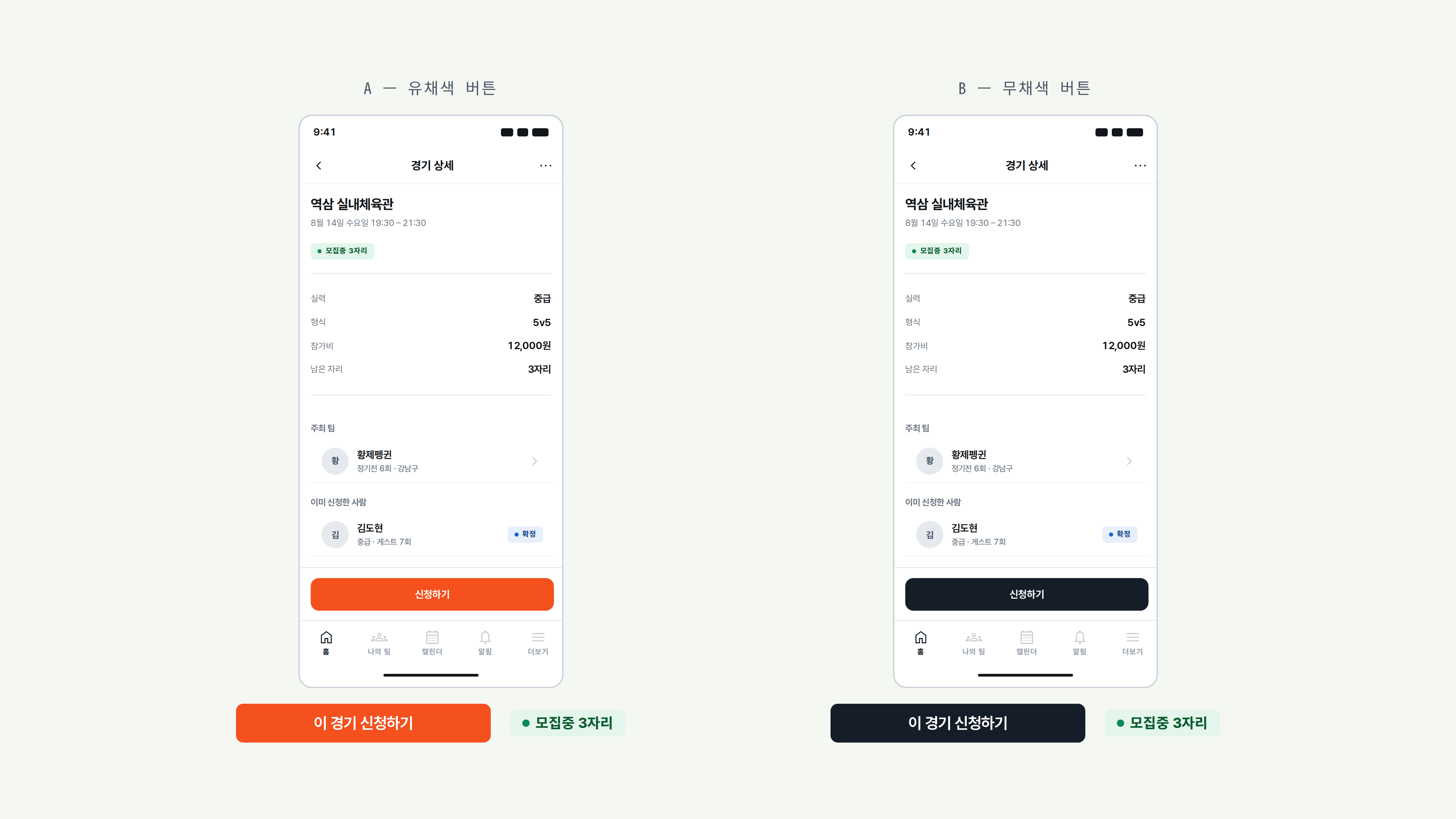
초기 화면에서는 오렌지가 신청 버튼과 마감임박 배지에 함께 사용되었습니다.
신청이 종료된 요소도 강한 채움색으로 표시되어, 행동 유도와 경기 상태가 구분되지 않았습니다.

In the first screens, orange was used for the apply button and for the closing-soon badge alike. Elements whose applications had already closed were filled just as strongly, so a call to action and a game state could not be told apart.

이를 개선하기 위해 주요 조작 요소에는 무채색을, 경기 상태에는 구분 색상을 적용했습니다.
색상은 상태 정보에 집중해 버튼과 상태가 서로 다른 신호를 전달하도록 했습니다.

To fix it, I let the main controls take neutral colour and game states take distinguishing colour. Colour concentrates on state information, so a button and a state carry different signals.

The same game detail screen rendered twice: A with an orange apply button, B with a black one, while the recruiting badge stays green in both
A 유채색 버튼 · B 무채색 버튼 — 버튼 색만 다르고 나머지는 동일 A coloured button · B neutral button — only the button colour differs
4-1 colors

왜 무채색인가?

Why neutral colour?

무채색 체계를 선택한 이유는 두 가지입니다. 첫째, 기본 지도 화면에는 25개가 넘는 POI 아이콘이 여러 색으로 표시됩니다. UI 요소에 같은 색을 쓰면 지도 아이콘과 구별하기 어려워집니다. 둘째, 색은 경기 신청 상태를 나타내는 데 쓰이므로 상태 정보를 위해 남겨두어야 했습니다.

그래서 버튼 · 칩 · 탭을 무채색으로 설계해, 강조색이 상태 정보에만 주목을 모으도록 했습니다.

A neutral colour system was chosen for two reasons. First, the default map screen carries 25+ POI icons in various colours; using those same colours for UI elements would make the two hard to tell apart. Second, colour indicates the status of a match application, so it had to be reserved for status information.

Buttons, chips and tabs were therefore designed in neutral colour, leaving the key colours to draw attention to status information alone.

Primary color
  • 0
  • 50
  • 100
  • 200
  • 300
  • 400
  • 500
  • 600
  • 700
  • 800
  • 900
  • 950
4-2 colors

경기 상태에 따른 색 구분Colour-coded by game state

다섯 가지 상태색은 배경(tint) · 핀과 점(solid) · 텍스트(text) 세 단계로 구성했습니다. 판단에 필요한 정보는 7:1 이상의 명도 대비를 유지하고, 상태명과 표시를 함께 사용해 어떤 상태도 색에만 의존하지 않도록 했습니다.

Each of the five state colours is structured across three levels: background (tint), pins and dots (solid), and text. Decision-critical information maintains a contrast ratio of at least 7:1, while labels and markers ensure that no state relies on colour alone.

  • tint #E4F5EC
    solid #0B8A57
    text #085C2E

    모집중Recruiting

    플레이어가 지도에서 가장 먼저 찾는 상태이므로, 텍스트는 배경과 7.20:1의 명도 대비를 확보했습니다.

    As this is the state players scan the map for first, its text maintains a 7.20:1 contrast against the background.

  • tint #FBF0D6
    solid #C2700A
    text #6B4606

    마감임박Closing Soon

    부족한 것은 자리가 아니라 시간입니다. 신청은 아직 열려 있으므로 빨강 대신 앰버를 사용했습니다. 명도 대비는 7.40:1입니다.

    Time, not availability, is running out. Amber is used instead of red because applications are still open. The contrast ratio is 7.40:1.

  • tint #E7EFFB
    solid #1B62D6
    text #12448C

    확정Confirmed

    다섯 상태 중 대비가 가장 높아, 확정된 경기가 자신의 경기임을 분명히 알아볼 수 있습니다. 명도 대비는 8.13:1입니다.

    The highest contrast of the five makes confirmed games clearly identifiable as the user’s own. The contrast ratio is 8.13:1.

  • tint #FBEAE8
    solid #C7302A
    text #8A1C14

    취소Cancelled

    빨강은 파괴적 동작과 공유해, 되돌릴 수 없는 상태를 일관되게 전달합니다. 명도 대비는 7.99:1입니다.

    Red is shared with destructive actions to consistently communicate an irreversible state. The contrast ratio is 7.99:1.

  • tint #EFF1F4
    solid #6E7884
    text #454D56

    마감Closed

    마감된 상태는 무채색을 유지해, 아직 행동할 수 있는 상태로 주의가 향하도록 했습니다. 명도 대비는 7.58:1입니다.

    The closed state remains colourless, keeping users’ attention on states where they can still take action. The contrast ratio is 7.58:1.

05 / Principles
design principle

정보를
의미와 맥락에
맞게 표현합니다.

Express information
according to its meaning
and context.

행동 · 상태 · 예측처럼 성격이 다른 정보를 분명히 구분하고, 관리 화면부터 지도와 외부 공유까지 각 맥락에 맞는 정보와 시각 언어를 정의합니다. 표현 규칙을 명확히 세워, 사용자가 인터페이스를 해석하지 않아도 의미와 확실성을 한눈에 알 수 있도록 합니다.

Clearly distinguish information types such as actions, states, and predictions, while defining the appropriate information and visual language for each context, from management screens to maps and external sharing. Establish clear rules for representation so that meaning and certainty can be understood at a glance, without requiring users to interpret the interface.

  1. 01

    행동과 상태를 구분합니다

    Separate action from state

    버튼 · 필터 · 탭은 무채색을 기본으로 사용하고, 경기 상태는 색과 상태명으로 구별합니다.

    Buttons, filters and tabs default to neutral; game state is told apart by colour together with the name of the state.

  2. 02

    예측과 확정을 구분합니다

    Separate a prediction from a fact

    예상 인원에는 점선 테두리와 범위 표기를 사용해, 확정된 정보와 다르게 읽히도록 설계합니다.

    A predicted headcount takes a dashed border and a range, so it reads differently from information that is settled.

  3. 03

    사용 맥락에 맞게 표현합니다

    Express it to fit where it is used

    관리 화면의 정보 밀도, 지도 위 요소의 식별, 외부 공유 시 필요한 정보를 각 환경에 맞게 정의합니다.

    Density on the management screens, legibility on the map, and what a shared post needs are each defined for their own setting.

06 / Foundations

반복되는 시각적 결정을
토큰으로 정리했습니다

The visual decisions that repeat,
settled into tokens

색상, 타이포그래피, 간격, 모서리 반경을 공통 값으로 정의했습니다.
각 값에는 사용 목적을 함께 기록해, 화면을 추가하거나 수정할 때 같은 기준을 적용할 수 있도록 했습니다.

Colour, typography, spacing and corner radius are defined as shared values. Each value carries a note on what it is for, so the same standard applies when a screen is added or changed.

6-2 typography

Typography

크기, 굵기, 행간의 조합만으로 정보의 층위를 구분했습니다. 색상 없이도 제목부터 본문까지 위계가 명확하게 읽히도록 타이포그래피 체계를 설계했습니다.

Information is separated into layers by size, weight and leading alone. The type system was designed so that the hierarchy from heading to body reads clearly without colour.

Pretendard

브랜드 성격과 구현 조건을 함께 만족하는 서체를 선택했습니다

Selected a typeface for both brand character and implementation

브랜드 키워드인 ‘정확한, 단단한, 빠른, 야외의, 활기찬’ 이미지를 기준으로 서체를 검토했습니다. 먼저 세리프를 제외하고, 산세리프 중에서도 정확하고 단단한 인상이 부족한 둥근 기하학 서체를 후보에서 제외했습니다.

The typeface was evaluated against five brand attributes: precise, solid, fast, outdoorsy and energetic. Serif typefaces were excluded first, followed by rounded geometric sans-serifs that lacked the precision and solidity the brand required.

남은 후보를 실제 화면에 적용해 비교한 결과, 한글 · 영문 · 숫자의 균형이 가장 자연스럽고 안정적인 Pretendard를 선택했습니다.

After testing the remaining candidates across actual screens, Pretendard was selected for its natural, stable balance between Hangul, Latin characters and numerals.

액센트 색이 없는 시스템에서는 굵기가 시각적 위계를 만듭니다. 다양한 웨이트를 지원하고, 오픈 라이선스로 개발자와 제약 없이 공유할 수 있어 앱과 문서 전반에 일관되게 적용했습니다.

With no accent colour in the system, font weight creates the visual hierarchy. Pretendard offers a wide range of weights and an open licence, allowing it to be shared easily with developers and applied consistently across the app and documentation.

Display 1 style
  • 01 13
    Display / Large
    Size
    34px
    Line height
    120%
    Letter spacing
    -2%
    Weight
    Semibold, Bold, Extra Bold
    Used in
    Onboarding, Empty state
    • Semibold

      모집은 짧게

    • Bold

      모집은 짧게

    • Extra Bold

      모집은 짧게

Number 2 styles
  • 02 13
    Number / Large
    Size
    28px
    Line height
    120%
    Letter spacing
    -2%
    Weight
    Semibold, Bold, Extra Bold
    Used in
    Prediction value
    • Semibold

      게스트 3~5명

    • Bold

      게스트 3~5명

    • Extra Bold

      게스트 3~5명

  • 03 13
    Number / Medium
    Size
    20px
    Line height
    120%
    Letter spacing
    0%
    Weight
    Semibold, Bold, Extra Bold
    Used in
    Price, Seats Left
    • Semibold

      12,000원 · 3/5명

    • Bold

      12,000원 · 3/5명

    • Extra Bold

      12,000원 · 3/5명

Heading 3 styles
  • 04 13
    Heading / Large
    Size
    24px
    Line height
    130%
    Letter spacing
    -2%
    Weight
    Semibold, Bold, Extra Bold
    Used in
    Screen title
    • Semibold

      오늘 뛸 경기

    • Bold

      오늘 뛸 경기

    • Extra Bold

      오늘 뛸 경기

  • 05 13
    Heading / Medium
    Size
    20px
    Line height
    130%
    Letter spacing
    -2%
    Weight
    Semibold, Bold, Extra Bold
    Used in
    Section title
    • Semibold

      다음 경기 준비

    • Bold

      다음 경기 준비

    • Extra Bold

      다음 경기 준비

  • 06 13
    Heading / Small
    Size
    18px
    Line height
    130%
    Letter spacing
    -2%
    Weight
    Semibold, Bold, Extra Bold
    Used in
    Card title, Venue
    • Semibold

      역삼 실내체육관

    • Bold

      역삼 실내체육관

    • Extra Bold

      역삼 실내체육관

Body 3 styles
  • 07 13
    Body / Large
    Size
    16px
    Line height
    150%
    Letter spacing
    0%
    Weight
    Regular, Medium, Semibold
    Used in
    Section title
    • Regular

      출석 응답 8명이 도착했습니다

    • Medium

      출석 응답 8명이 도착했습니다

    • Semibold

      출석 응답 8명이 도착했습니다

  • 08 13
    Body / Medium
    Size
    14px
    Line height
    150%
    Letter spacing
    0%
    Weight
    Regular, Medium, Semibold
    Used in
    Supporting text
    • Regular

      최근 6경기 평균 기준

    • Medium

      최근 6경기 평균 기준

    • Semibold

      최근 6경기 평균 기준

  • 09 13
    Body / Small
    Size
    12px
    Line height
    150%
    Letter spacing
    0%
    Weight
    Regular, Medium, Semibold
    Used in
    Meta information
    • Regular

      중급 · 5v5 · 12,000원

    • Medium

      중급 · 5v5 · 12,000원

    • Semibold

      중급 · 5v5 · 12,000원

Label & Caption 4 styles
  • 10 13
    Label / Large
    Size
    14px
    Line height
    130%
    Letter spacing
    0%
    Weight
    Regular, Medium, Semibold
    Used in
    Button label
    • Regular

      이 경기 신청하기

    • Medium

      이 경기 신청하기

    • Semibold

      이 경기 신청하기

  • 11 13
    Label / Medium
    Size
    12px
    Line height
    130%
    Letter spacing
    0%
    Weight
    Semibold, Bold, Extra Bold
    Used in
    Filter chip
    • Semibold

      오늘 · 저녁 · 초중급

    • Bold

      오늘 · 저녁 · 초중급

    • Extra Bold

      오늘 · 저녁 · 초중급

  • 12 13
    Label / Small
    Size
    11px
    Line height
    130%
    Letter spacing
    2%
    Weight
    Semibold, Bold, Extra Bold
    Used in
    Status badge · Section header
    • Semibold

      모집 중 3자리

    • Bold

      모집 중 3자리

    • Extra Bold

      모집 중 3자리

  • 13 13
    Caption
    Size
    11px
    Line height
    130%
    Letter spacing
    2%
    Weight
    Regular, Medium, Semibold
    Used in
    Time stamp · Source note
    • Regular

      2시간 전 업데이트

    • Medium

      2시간 전 업데이트

    • Semibold

      2시간 전 업데이트

6-3 spacing

Spacing

간격은 0–12에서 2px, 12–24에서 4px, 24–48에서 8px, 그 이상에서 16px씩 커집니다. 작은 간격은 세밀한 조정을, 큰 간격은 일정한 리듬을 맡아 밀도와 구조를 함께 지킵니다.

The scale increases by 2px from 0–12, 4px from 12–24, 8px from 24–48, and 16px beyond. Smaller spaces allow precise adjustments, while larger spaces follow a consistent rhythm to maintain both density and structure.

  • 4px
  • 8px
  • 12px
  • 16px
  • 20px
  • 24px
  • 32px
  • 48px
  • 64px
6-4 radius & shadows

Radius

각 값은 표준보다 한 단계 크게 잡아, 브랜드의 따뜻함을 강조색이 아니라 형태로 전달합니다.

Each value is one step larger than the standard, preserving the brand’s warmth through form rather than accent colour.

  • Badge 6
  • Thumbnail 10
  • Button · Input 12
  • Card 16
  • Sheet 20
  • Chip full

Shadows

색을 걷어낸 자리에서 그림자가 시각적 위계의 주요 단서가 되었습니다. 다섯 단계의 elevation을 정의하고, 각 단계를 특정 UI 역할에 대응시켰습니다.

With colour removed, shadows became the primary cue for visual hierarchy. We defined five elevation levels, each mapped to a specific UI role.

  • Surface GameCard (default), Input, AppHeader
  • Raised SearchBar, FilterChip (on map), Snackbar
  • Floating FAB, GameCard (on map), Dropdown
  • Anchored BottomSheet, BottomNav
  • Overlay Modal, ConfirmDialog
6-5 icon

Icon

본문 텍스트인 Pretendard와 시각적 무게가 맞도록 Material Symbols Outlined 400을 선택했습니다. 모든 상태에는 아이콘이나 레이블을 함께 사용해, 정보가 색에만 의존하지 않도록 했습니다.

Material Symbols Outlined 400 was selected to match the visual weight of Pretendard body text. Every state is also paired with an icon or label, ensuring that information never relies on colour alone.

  • chevron_right chevron_right GameCard, 목록 행 진입 GameCard, list row
  • chevron_left chevron_left AppHeader 뒤로 AppHeader, back
  • more_horiz more_horiz AppHeader 더보기 AppHeader, overflow
  • home home BottomNav 홈 BottomNav, home
  • groups groups BottomNav 나의팀, 참여자 BottomNav, my team
  • calendar_month calendar_month BottomNav 캘린더, 날짜 필터 BottomNav, date filter
  • notifications notifications AppHeader 알림 AppHeader, alerts
  • menu menu AppHeader 메뉴 AppHeader, menu
  • my_location my_location 지도 현재 위치 Map, recentre
  • search search SearchBar SearchBar
  • remove remove 인원 스테퍼 감소 Stepper, decrease
  • add add FAB 경기 생성, 스테퍼 증가 FAB, new game
  • check check 확정 배지, 선택 완료 Confirmed badge
  • close close Modal · BottomSheet 닫기 Modal, dismiss
  • sports_basketball sports_basketball 지도 핀, 경기 카드 Map pin, GameCard
  • edit edit 경기 수정 Edit game
  • content_copy content_copy 모집 글 복사 Copy recruiting post
  • filter_list filter_list FilterChip, 목록 필터 FilterChip, list filter
  • schedule schedule 경기 시간 Game time
  • location_on location_on 경기 장소, 지도 핀 Venue, map pin
  • lock lock 팀장 권한, 비공개 경기 Lead-only, private
  • person person 팀장, 프로필 Team lead, profile
07 / Components

반복 요소를 정의하고
화면의 맥락에 맞게 조합했습니다

Repeating elements defined,
then composed to fit each screen

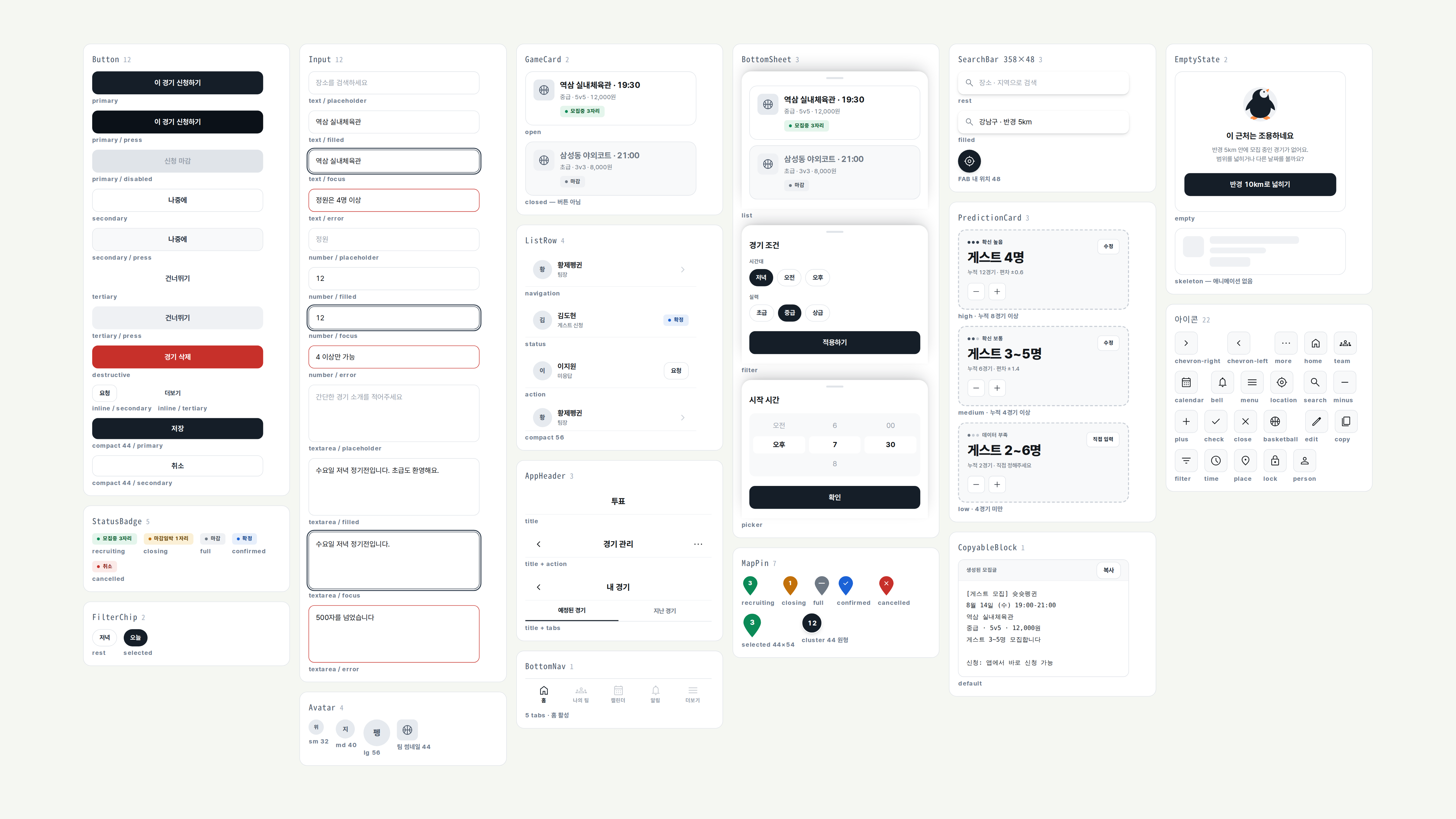
버튼, 필터, 배지 등 공통 요소와 지도 핀, 수요 예측 카드 등
서비스 고유 요소를 컴포넌트로 정리했습니다.

Shared elements (buttons, filters, badges) and elements particular to this service (map pins, prediction cards) were organised into components.

The component set: shared parts such as buttons, filters and badges alongside the map pin and prediction card built for this service
08 / Enforcement

문서의 규칙을
코드에서도 확인했습니다

The rules in the document,
checked in the code as well

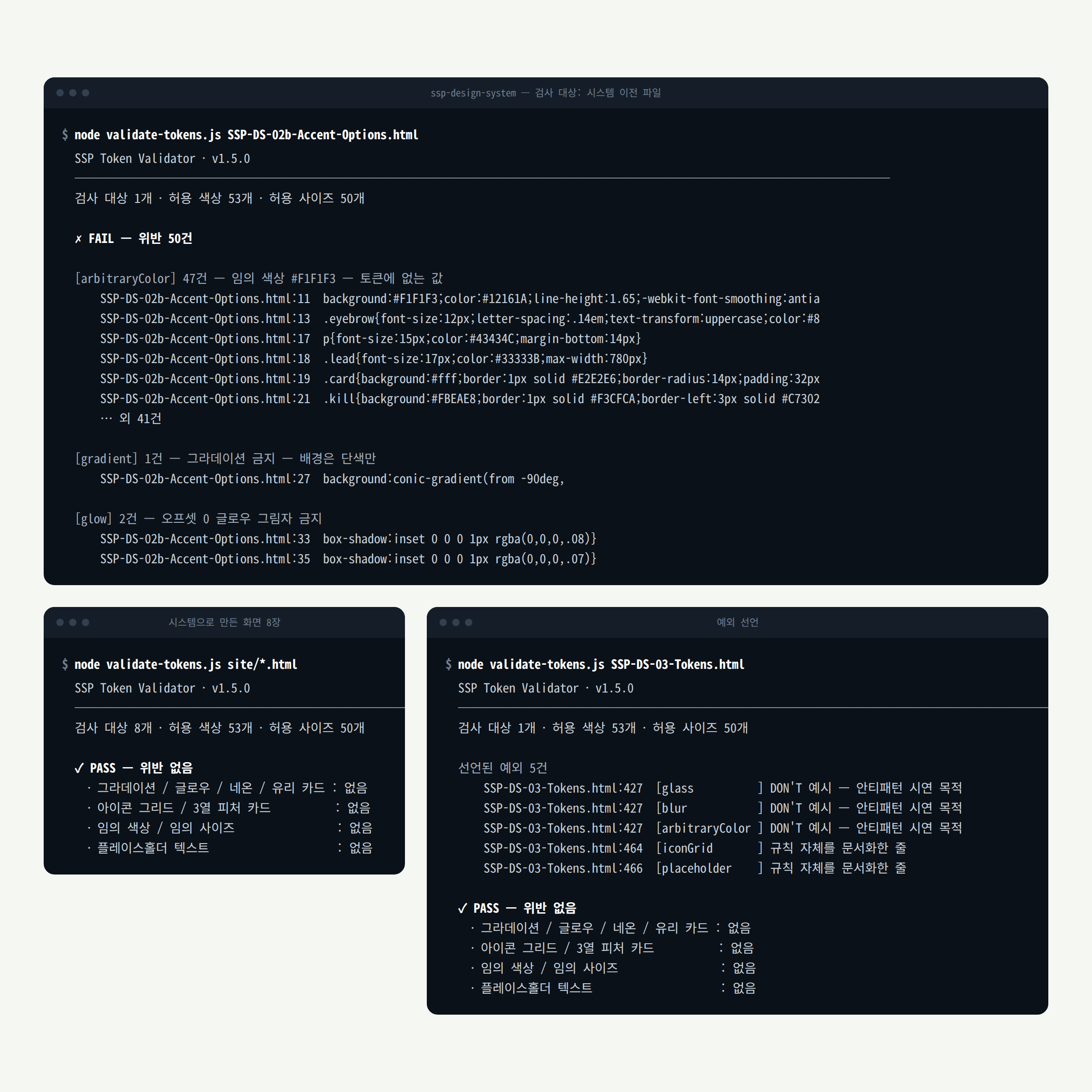
HTML/CSS로 제작한 시안에 검사 스크립트를 적용해, 다음 항목을 확인했습니다.

A checking script runs over the mockups built in HTML and CSS, looking for the following.

  • 허용 목록에 없는 색상과 크기Colours and sizes that are not on the allowed list
  • 사용이 금지된 효과Effects the system forbids
  • 아직 남아 있는 임시 문구Placeholder text still left in place

반복해서 확인해야 하는 항목은 자동화해 수정 과정에서 규칙이 빠지는 일을 줄였습니다.
다만 이 검사는 코드에 정의된 규칙을 지켰는지만 확인했습니다.

Automating the checks that have to run again and again means that fewer rules go missing while a screen is being changed.
The check only confirms that the rules written into the code were kept.

The checker's output: each rule listed with the places it flagged in the HTML and CSS
09 / What I Learned

규칙을 만드는 것만큼
적용하며 확인하는 과정이 중요했습니다

Applying the rules mattered as much as writing them

초기 화면을 검토하며 버튼과 상태 표현의 충돌을 발견했고, 공통 규칙을 실제 화면에 적용하며 빠진 정의와 잘못된 연결을 확인했습니다. 문서, 컴포넌트, 코드가 같은 기준을 따르는지 점검하는 과정까지 시스템 설계에 포함된다는 것을 배웠습니다.

Reviewing the early screens surfaced a collision between buttons and state. Applying the shared rules to real screens then exposed missing definitions and wrong connections. Checking that the document, the components and the code follow one standard turned out to be part of designing the system, not a step after it.

Done
토큰 · 컴포넌트 · 브랜드 자산을 정의하고, 검사 스크립트로 규칙 준수를 확인했습니다.
Tokens, components and brand assets defined; rule compliance checked by the validator.
In progress
디자인 시스템 v1.5.0을 기준으로 화면 개편을 진행하고 있습니다.
Rebuilding the screens against design system v1.5.0.
Next to validate
개발 구현과 디자인의 차이를 점검하고, 실제 사용자가 경기 상태와 예측 정보를 구별할 수 있는지 확인합니다.
Check the gap between build and design, then whether real users can tell game state from predicted numbers.
Shoot Shoot Penguin mark Shoot Shoot Penguin · Design System v1.5.0